Teams that should revert to their older uniforms

Reverend Conehead

Well-Known Member
Messages
9,918
Reaction score
11,787
These are the teams that had some modern designer come up with stupid uniforms to replace uniforms that were already good.

1. The Rams
The best uniforms this team ever had were the iconic blue and white ones from about 1970. After that, they went with those yellow and blue ones that were just plain tacky. They've tried other things like gold and blue, which were passable, but now they have these lame uniforms with softer blue and yellow, and they split the iconic ram horn logo. Blech. Their horn logo was iconic and should never have been changed. Revert to the early 70s era blue and whites, and don't ever touch yellow again.

2.
The Jets
The Jets should never have changed the iconic Joe Namath era uniforms with the white helmets and Jets logo on the side. They killed those off in the 80s, and looked like crap with their green helmets. Bill Parcells was smart enough to bring the Namath uniforms back, but the team has recently gone back to the crappy green helmets. They should stop the BS. Their Super Bowl 3 Joe Namath era uniforms were iconic and great. They need to revert to that, and throw out all the garbage unis they've used.

3
The Broncos
The 90s-era uniform design made them look awful. The logo on the helmet looks like a chess piece. Then they have that tacky stripe going down their jersey and onto the pants. It's totally try hard. Revert to the Orange Crush unis of Super Bowl 12. Those were the best ones.
 

Rayman70

Well-Known Member
Messages
33,015
Reaction score
31,375
These are the teams that had some modern designer come up with stupid uniforms to replace uniforms that were already good.

1. The Rams
The best uniforms this team ever had were the iconic blue and white ones from about 1970. After that, they went with those yellow and blue ones that were just plain tacky. They've tried other things like gold and blue, which were passable, but now they have these lame uniforms with softer blue and yellow, and they split the iconic ram horn logo. Blech. Their horn logo was iconic and should never have been changed. Revert to the early 70s era blue and whites, and don't ever touch yellow again.

2.
The Jets
The Jets should never have changed the iconic Joe Namath era uniforms with the white helmets and Jets logo on the side. They killed those off in the 80s, and looked like crap with their green helmets. Bill Parcells was smart enough to bring the Namath uniforms back, but the team has recently gone back to the crappy green helmets. They should stop the BS. Their Super Bowl 3 Joe Namath era uniforms were iconic and great. They need to revert to that, and throw out all the garbage unis they've used.

3
The Broncos
The 90s-era uniform design made them look awful. The logo on the helmet looks like a chess piece. Then they have that tacky stripe going down their jersey and onto the pants. It's totally try hard. Revert to the Orange Crush unis of Super Bowl 12. Those were the best ones.
I agree, especially on the Broncos.
 

Flamma

Well-Known Member
Messages
21,800
Reaction score
18,665
These are the teams that had some modern designer come up with stupid uniforms to replace uniforms that were already good.

1. The Rams
The best uniforms this team ever had were the iconic blue and white ones from about 1970. After that, they went with those yellow and blue ones that were just plain tacky. They've tried other things like gold and blue, which were passable, but now they have these lame uniforms with softer blue and yellow, and they split the iconic ram horn logo. Blech. Their horn logo was iconic and should never have been changed. Revert to the early 70s era blue and whites, and don't ever touch yellow again.

2.
The Jets
The Jets should never have changed the iconic Joe Namath era uniforms with the white helmets and Jets logo on the side. They killed those off in the 80s, and looked like crap with their green helmets. Bill Parcells was smart enough to bring the Namath uniforms back, but the team has recently gone back to the crappy green helmets. They should stop the BS. Their Super Bowl 3 Joe Namath era uniforms were iconic and great. They need to revert to that, and throw out all the garbage unis they've used.

3
The Broncos
The 90s-era uniform design made them look awful. The logo on the helmet looks like a chess piece. Then they have that tacky stripe going down their jersey and onto the pants. It's totally try hard. Revert to the Orange Crush unis of Super Bowl 12. Those were the best ones.
Agree on the Jets and Broncos. But the Rams change is so egregious it deserves its own post. The unis they had that you called tacky, I think they went to them due to the other LA teams having the same color scheme. The Lakers and Kings both had blue and yellow at the time. Some cities have been known to do this, Pittsburgh Steeler, Penguins, Pirates.

I liked the old Patriots uniforms better too.
 

Flamma

Well-Known Member
Messages
21,800
Reaction score
18,665
Miami is first on that list for me.

The blue totally changed. The new logo is terrible.
I didn't even notice. LOL, maybe if they were in the playoffs more often I would have.
 

CowboyChris

Well-Known Member
Messages
7,386
Reaction score
4,800
These are the teams that had some modern designer come up with stupid uniforms to replace uniforms that were already good.

1. The Rams
The best uniforms this team ever had were the iconic blue and white ones from about 1970. After that, they went with those yellow and blue ones that were just plain tacky. They've tried other things like gold and blue, which were passable, but now they have these lame uniforms with softer blue and yellow, and they split the iconic ram horn logo. Blech. Their horn logo was iconic and should never have been changed. Revert to the early 70s era blue and whites, and don't ever touch yellow again.

2.
The Jets
The Jets should never have changed the iconic Joe Namath era uniforms with the white helmets and Jets logo on the side. They killed those off in the 80s, and looked like crap with their green helmets. Bill Parcells was smart enough to bring the Namath uniforms back, but the team has recently gone back to the crappy green helmets. They should stop the BS. Their Super Bowl 3 Joe Namath era uniforms were iconic and great. They need to revert to that, and throw out all the garbage unis they've used.

3
The Broncos
The 90s-era uniform design made them look awful. The logo on the helmet looks like a chess piece. Then they have that tacky stripe going down their jersey and onto the pants. It's totally try hard. Revert to the Orange Crush unis of Super Bowl 12. Those were the best ones.
I disagree on the Broncos, their old unis were hiddeous especially their helmuts, you can add the Commanders to that list, their uni's are a disgrace especially the black ones
 

Aerolithe_Lion

Well-Known Member
Messages
10,785
Reaction score
11,694
n1nal7ad4oe9cx7tqmva.jpg


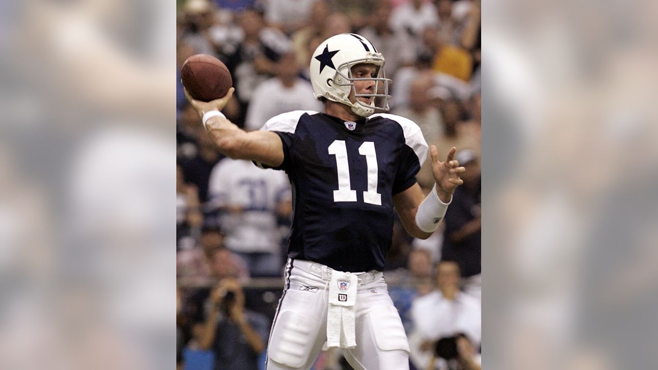
Ditch the stripes down the middle of the helmet so it’s all white only with blue stars, and that’s a keeper
 

bigdnlaca

Well-Known Member
Messages
2,693
Reaction score
1,251
The Saints gold unis were cool to me because it was allowed to be the road jersey.

The creamsicle jersey is cool now because Tampa would change the entire stadium theme.

The Titans (Oilers) AFL anniversary jerseys.
 

Reverend Conehead

Well-Known Member
Messages
9,918
Reaction score
11,787
we need to burn those seafoam color pants we wear at times.
I agree with this. The green tint was added so they would stand out on old-style televisions that are no longer in use. I think they should just use the same silver pants they use for the away uniforms, or come out with grey pants or bluish grey. The Seafoam ones are awful and don't go with the rest of the uniform.
 

Rayman70

Well-Known Member
Messages
33,015
Reaction score
31,375
I agree with this. The green tint was added so they would stand out on old-style televisions that are no longer in use. I think they should just use the same silver pants they use for the away uniforms, or come out with grey pants or bluish grey. The Seafoam ones are awful and don't go with the rest of the uniform.
Exactly
 

Xelda

Well-Known Member
Messages
5,234
Reaction score
17,911
@Aerolithe_Lion I don't mean any disrespect, but I think the stripes on the helmet are one of our things. Just like the seafoam colored pants. Maybe it's all a mess, but it's our mess and has been stamped in time as one of our looks. The athletes change but the look is a touch stone to many fans.
 

Flamma

Well-Known Member
Messages
21,800
Reaction score
18,665
I agree with this. The green tint was added so they would stand out on old-style televisions that are no longer in use. I think they should just use the same silver pants they use for the away uniforms, or come out with grey pants or bluish grey. The Seafoam ones are awful and don't go with the rest of the uniform.
What I don't understand is why they enhanced it. Now you can't miss it.
 

Reverend Conehead

Well-Known Member
Messages
9,918
Reaction score
11,787
What I don't understand is why they enhanced it. Now you can't miss it.
If I understand correctly, that greenish tint made the pants have better definition on old-style, low-res TVs, and you couldn't even see the green tint. Now on our high res TVs, we can see everything. The reason for that green tint is now obsolete. It would make more sense to go with a plain grey or possibly bluish gray, or just use those same silver away pants.
 
Top