I couldn't resist, so I looked at each uniform.
Bears: Not worthy of prime time
Bengals: Without the swirls on the legs. Change the number font.
Bills: The artist enjoys bold streaks of color. No wording across the groin! Regular numbers across the Buffalo icon.
Broncos: Number in the same color as the design on the jersey is confusing
Browns: They've suffered enough
Bucs: That uniform would be "booed" off the field
Cardinals: Remove the eye from the chest and put regular football jersey numbers in the middle
Chargers: Less lightning, regular football numbers
Chiefs: I heard feathers are in this year
Colts now glow in the dark
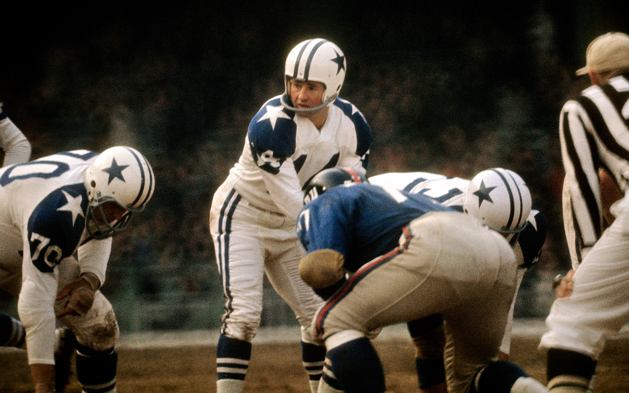
Cowboys:

Dolphins: Alternate uniforms below the top picture belong on RuPaul's Drag Race
Eagles: The worst uniform. Picture the Seahawks color rush uniforms.
Falcon's: A respectful representation
No comment, no comment, no comment
Lions: Nice jersey but no one wants to read groins.
GB: Can't cure ugly
The designer obviously hates the Panthers and Patriots,
Raiders: Cool design of a sword in the jersey
Rams: Swirlies gone wild
Raven's: 50 shades of wrong
Commanders: Nobody wants a picture of a feather there!
Saints: Shows promise
Seahawks: Officially as bad if not worse than the Eagles
Steelers: It's so disrespectful that I'm rather fond of it
Texans: Why not.
Titans: I've seen worse
Vikings: Look like they're main sponsor is a steak house, move the Viking emblem up to the chest and keep the gold stripe on the shoulders