You are using an out of date browser. It may not display this or other websites correctly.
You should upgrade or use an alternative browser.
You should upgrade or use an alternative browser.
Yet Another Uniform Thread
- Thread starter casmith07
- Start date
cowboyschmps3
Well-Known Member
- Messages
- 5,379
- Reaction score
- 1,881
Watch out with these threads that no matter what we say about uniform these threads won't help lol they can delete your thread bro, just a heads up.
Payton34Smith22
Active Member
- Messages
- 1,484
- Reaction score
- 11
I've always thought silver pants with silver helmets, would look really nice.
DallasCowboys2080
Well-Known Member
- Messages
- 2,878
- Reaction score
- 2,790
I was a fan of the big shoulder stars from '94. It might look a tad dated now though. Maybe it could be salvaged.
i love the mitchell n ness double star jersey. still my favorite jerseys of them all. i love that look. from a distance its hard to miss those big double shoulder stars. which is why i like them. can't mistake a jersey like that for any other teams jersey as oppose to the regular jerseys without the shoulder stars.
Muhast
Newo
- Messages
- 7,661
- Reaction score
- 368
I was a fan of the big shoulder stars from '94. It might look a tad dated now though. Maybe it could be salvaged.
They could use thethrowback jersey with current silver pants and silver helmet to get a similar look to the double star.
fgoodwin
Well-Known Member
- Messages
- 1,527
- Reaction score
- 642
I don't have a link, but I recall reading an article online or in one of the many books about the Cowboys, that it was Tex Schramm's decision to add a hint of green to the home pants, because he thought the traditional silver-blue pants looked too flat and too gray on the TV sets of that time.What I want to know was how that choice in flavor of silver came about in the 80s. What was the conversation like when that was being discussed as an option and why they went with it. Does anyone know?
Ever mindful of appearances, especially on television, he wanted the Cowboys to look their best at all times. He figured just a tint of green would not be noticeable to fans in the stadium but would improve the look immensely on TV. So it was done. The problem came with the introduction of hi-def televisions in the late 90s. Tex was long gone, and what appeared hardly noticeable to fans in the stands, suddenly became quite evident to fans watching at home. At least, that's the story as I recollect reading it. Like I said, I have no link to back up this story.
I still hate the green pants with a passion. They should go back to the silver-blue pants of the 70s, in my opinion.
DallasCowboys2080
Well-Known Member
- Messages
- 2,878
- Reaction score
- 2,790
I don't have a link, but I recall reading an article online or in one of the many books about the Cowboys, that it was Tex Schramm's decision to add a hint of green to the home pants, because he thought the traditional silver-blue pants looked too flat and too gray on the TV sets of that time.
Ever mindful of appearances, especially on television, he wanted the Cowboys to look their best at all times. He figured just a tint of green would not be noticeable to fans in the stadium but would improve the look immensely on TV. So it was done. The problem came with the introduction of hi-def televisions in the late 90s. Tex was long gone, and what appeared hardly noticeable to fans in the stands, suddenly became quite evident to fans watching at home. At least, that's the story as I recollect reading it. Like I said, I have no link to back up this story.
I still hate the green pants with a passion. They should go back to the silver-blue pants of the 70s, in my opinion.
wow. thats fascinating. that makes perfect sense if that was the case as to the decision to go with the green tint on those pants. Schramm knew what he was doing. i can also see your point about the HD situation. i think now its just too much tradition and its hard to leave it. im no fan of a flat silver look but if they can find away to make a silver in pants stand out like no other team without the green tint i might be for it.
fgoodwin
Well-Known Member
- Messages
- 1,527
- Reaction score
- 642
I found the article:
http://www.dallasobserver.com/blogs/dallas-cowboys-changing-uniforms-7098065
"For years and years and years me and my brother have wondered why the Cowboys' home pants looked - from some angles, in a certain light - green. Ish. Turns out it's because they are. Tex Schramm designed them that unique shade because, on TV, it came across blue-gray-silver.
"When fans go to our home games in person the No. 1 grief we hear about is the green pants," says Cowboys vice president of merchandising Bill Priakos. "Now we're hearing it from fans watching on TV because of HD. It's too realistic."
On old-school TV, Cowboys' green came across silver. On HD TV, Cowboys' green comes across, well, green."
TVMan
Active Member
- Messages
- 821
- Reaction score
- 75
Honestly I never even noticed the tinge of green in the pants. Always looked silver/gray to me. You really have to study in detail to notice that. I'm fine with the way it is
Agreed and Exactly.
The material was developed to absorb light. You can look at a photo and see different shades/levels of color on those pants from the differing light sources cast upon them. At times, they appear more silver blue than silver green. Depends on the light.
fgoodwin
Well-Known Member
- Messages
- 1,527
- Reaction score
- 642
Here are the current seafoam green pants (notice how they do not match the helmets):

Here are the current silver pants (closer to the helmet color but still off slightly):

And here are my personal favorites, more of a silver-blue (a perfect match to the helmets):

Honestly, to those who can't see the green, I wonder if color blindness runs in your family? That's an honest question, it is not meant to be a slight. Because the green is very obvious to me and many other fans.
Finally, all images are un-retouched by me -- I link directly to the image. I cannot vouch for whether or not the original images have been modified by whoever posted them at the source links.

Here are the current silver pants (closer to the helmet color but still off slightly):

And here are my personal favorites, more of a silver-blue (a perfect match to the helmets):

Honestly, to those who can't see the green, I wonder if color blindness runs in your family? That's an honest question, it is not meant to be a slight. Because the green is very obvious to me and many other fans.
Finally, all images are un-retouched by me -- I link directly to the image. I cannot vouch for whether or not the original images have been modified by whoever posted them at the source links.
fgoodwin
Well-Known Member
- Messages
- 1,527
- Reaction score
- 642
That may be true, but the key is (in my opinion), regardless of the light, the pants NEVER match the helmets. Only the 70s pants (posted above from 1976) match the helmets in ALL angles and brightnesses of light.Agreed and Exactly.
The material was developed to absorb light. You can look at a photo and see different shades/levels of color on those pants from the differing light sources cast upon them. At times, they appear more silver blue than silver green. Depends on the light.
Of course, matching the helmets is not important to some. I get that. But I still don't like it.
Muhast
Newo
- Messages
- 7,661
- Reaction score
- 368
Agreed and Exactly.
The material was developed to absorb light. You can look at a photo and see different shades/levels of color on those pants from the differing light sources cast upon them. At times, they appear more silver blue than silver green. Depends on the light.
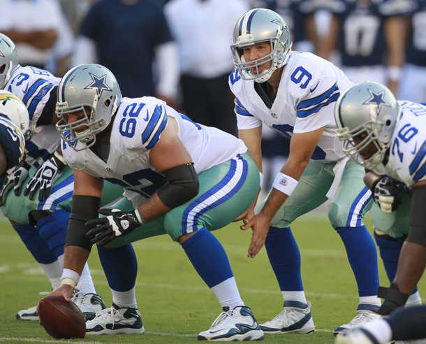
During day games they look really green. Here are some pics of our various shades


BAT
Mr. Fixit
- Messages
- 19,443
- Reaction score
- 15,607
Thanks, and but just to be clear.
The Throwback version is the 90's Double Star, which used Silver Helmets.
The league no longer allows multiple helmets. That eliminates the use of the White throwback helmet.
The blue pants are just a "concept only" conversation starter. No way I would like to see that happen for real.
As for alternates, you can bet that there will be some sort of third jersey coming. There is money to be made.
I saw that you were paying homage to our 90s throwbacks, just wasn't a fan of the mixed look. And I hope losing the white helmets is temp and NFL will regain it's senses. Loved those white helmets!
And keep those alternates ideas coming, may even change mind on the blue pants. All in all, great stuff!
MrPeanutbutter
What is this, a crossover episode?
- Messages
- 4,105
- Reaction score
- 3,099
Here's probably one of the best examples that I have seen.
You see hints of blue, silver and yes, green. All dictated by light.

Thanks. Now I can't unsee it. I noticed it before, but now I'm distracted.
If I'm tweaking the uni:
1) Color match helmet/pants
2) Color match helmet blue and the rest of the uni blue.
Let's be honest, though. What matters is that the unis look good on television. For that reason, you can get away with the green in the pants, because the players are standing on a green playing surface.
You don't have to look far for another team who have uniforms heavily dictated by playing surface. A couple of years back, when the Dallas Stars redid their uniforms, they went with a really light green for the sweater because on TV, the previous greens looked black. On ice, the new green looks distinctly green.
BAT
Mr. Fixit
- Messages
- 19,443
- Reaction score
- 15,607
Here are the current seafoam green pants (notice how they do not match the helmets):

Here are the current silver pants (closer to the helmet color but still off slightly):

And here are my personal favorites, more of a silver-blue (a perfect match to the helmets):

Honestly, to those who can't see the green, I wonder if color blindness runs in your family? That's an honest question, it is not meant to be a slight. Because the green is very obvious to me and many other fans.
Finally, all images are un-retouched by me -- I link directly to the image. I cannot vouch for whether or not the original images have been modified by whoever posted them at the source links.
Silver pants with the current dark blues match silver helmets the closest IMO. The 70s silver pants have more of a bluish tinge. Silver greens are also more shiney, less flat/dull.
Either silver blue or silver green pants work for me, just keep the royal blue in the classic whites jerseys.
- Messages
- 106,611
- Reaction score
- 126,003

All I see in that pic is how fat Romo looks.
TexasBacon
Well-Known Member
- Messages
- 803
- Reaction score
- 1,831
I saw they aren't wearing the blues on Thanksgiving this year as the Panthers released their uniform schedule and are wearing colored jerseys vs us on Thanksgiving. I bet Philadelphia will make Dallas wear blue in week 2, and so will the Dolphins when we play them in Miami. I wouldn't have a problem with the whites so much if Jerry would just fix the terrible green pants.... in fact if they just fixed the pants and only used navy they would be the best uniforms in sports. And stop with "the green pants are tradition" argument. They matched the silver helmet for the most part until the mid 80's. Schramm wanted them TO LOOK SILVER on TV, and the blue/green tint accomplished that. Keeping the green tint with HD TV is a straight slap in Texas Schramm's face, as his intent was for the helmet and pants to appear to be metallic silver. I bet Nike has the technology to make a unique shade of silver blue that perfectly matches the helmet but still stands out from the flat grey look of the Lions, Patriots, Panthers, Raiders, etc.
Last edited:

